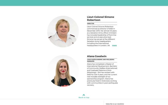
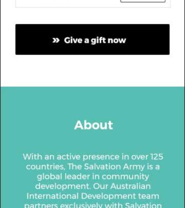
The Salvation Army International Development (SAID) is a department of The Salvation Army Australia working within the field of international aid and development work.
Goal of the project
SAID requested the current website need a complete face-lift to attract a younger audience (25-35 years old) as well as an existing audience (30-50 years old female).
They also pointed out the site didn’t convey their brand values well enough to build trust.
To raise sufficient funds for current and future salvo’s sponsorship programs, they plan to use the site as a marketing tool so that the team will be able to promote appeals and services such as ‘Self Denial Appeal‘ and ‘Salvos Gifts’ to potential donors.
My Role
As a senior designer, I was responsible for communicating effectively with stakeholders who were novices to web production processes. I helped them create a sitemap and web content suitable for the target audience and adequately optimised for SEO.
Also, I produced wireframes and visual design including HTML and CSS coding. Worked alongside graphic designers, developers, copywriters and project managers from the beginning to the end. I ensured not only the site met all the governmental requirements, but also its brand guidelines were implemented.


Approach
I started this project with the heuristic analysis of 4 competitors to research their audience, navigation labels, offered services and social media and content strategy.
World Vision Australia
(https://www.worldvision.com.au/)
Compassion Australia
(https://www.compassion.com.au/)
Plan
(https://www.plan.org.au/)
Child Fund
(https://www.plan.org.au/)


Findings & Learnings
- High-quality images and videos to create an emotional impact
- Prominent call to actions such as ‘Donate now’ and ‘Sponsor a child’ on the header.
- Predefined donation amounts for users to select
- Storytelling to build empathy
- Mobile friendly websites
- Infographics to show where the funds go
- Membership logos to build trust
- Easy access to ‘Contact’ and ‘Help’ content
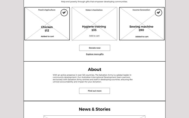
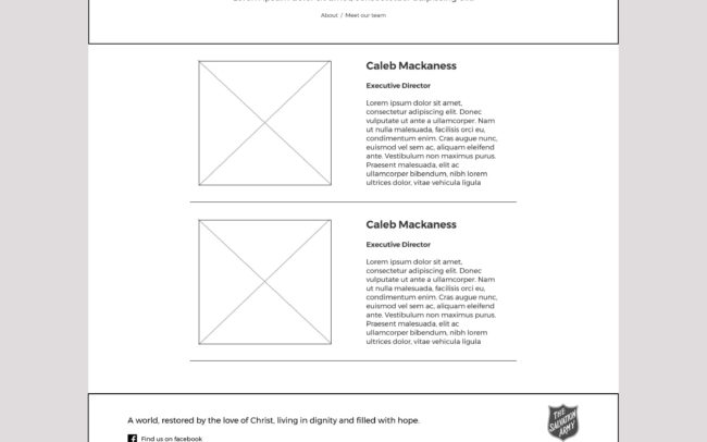
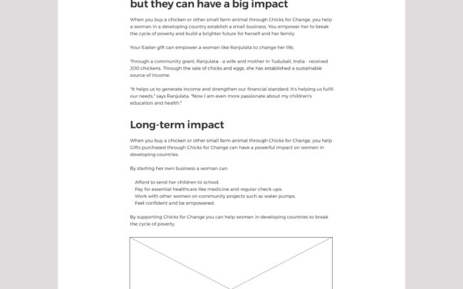
Wireframes
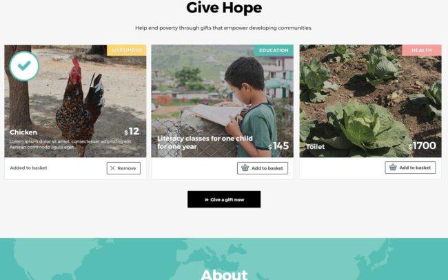
Mockups
Results

